
4 tips for young web designers
By Michał Durys
If you are a designer just starting your journey, here are some tips that might interest you! Enjoy reading and start your new project with a few extra cards up your sleeve.
Heading sizes vs body text
It seems like the most basic thing imaginable, and yet every now and then we can feel uncertain about picking the correct font size. It’s known that making the right call is important for both usability and legibility of the webpage text – and this, in turn, is directly related to the amount of time that users spend on the website. Incorrectly selected heading and body sizes can confuse the content’s priorities – users won’t know what to focus on and what we’re really trying to tell them. Disheartened and overwhelmed, the viewer won’t even bother to concentrate on the header, nor on the short body.
Text justification
No doubt, you’ve had a customer ask you to justify their text in the past. Even though it might be a standard procedure when preparing books for print, text justification is highly undesirable as a method of editing when it comes to digital content. Why is that? Again, it’s all about the comfort of our web page user. Digital text is most likely to appear in narrow blocks. Justification creates larger spacing between words, which not only distorts perception, but also doesn’t look very aesthetic.
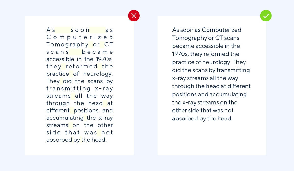
Spacing should be kept equal throughout the entire text – we can see that with justification it’s completely off.
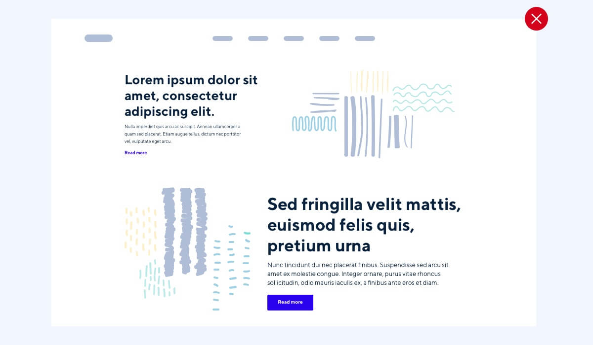
Hierarchy and consistency
So we’re done with fonts and justification, what’s next?
A correct way of categorizing content and its hierarchization on your page is another basic but crucial issue. Laying out and arranging text can be quite confusing at times and we know how much of a difference it can make for the reader. The most common mistake is probably not having a well-thought-out style guide and ignoring its premises. Every now and then you come across a site where every subpage has a different body text size, color or lines – and consistency is the key to comfortable content reception. It’s also a good idea to pay extra attention to keeping an invariable style and a good text hierarchization.
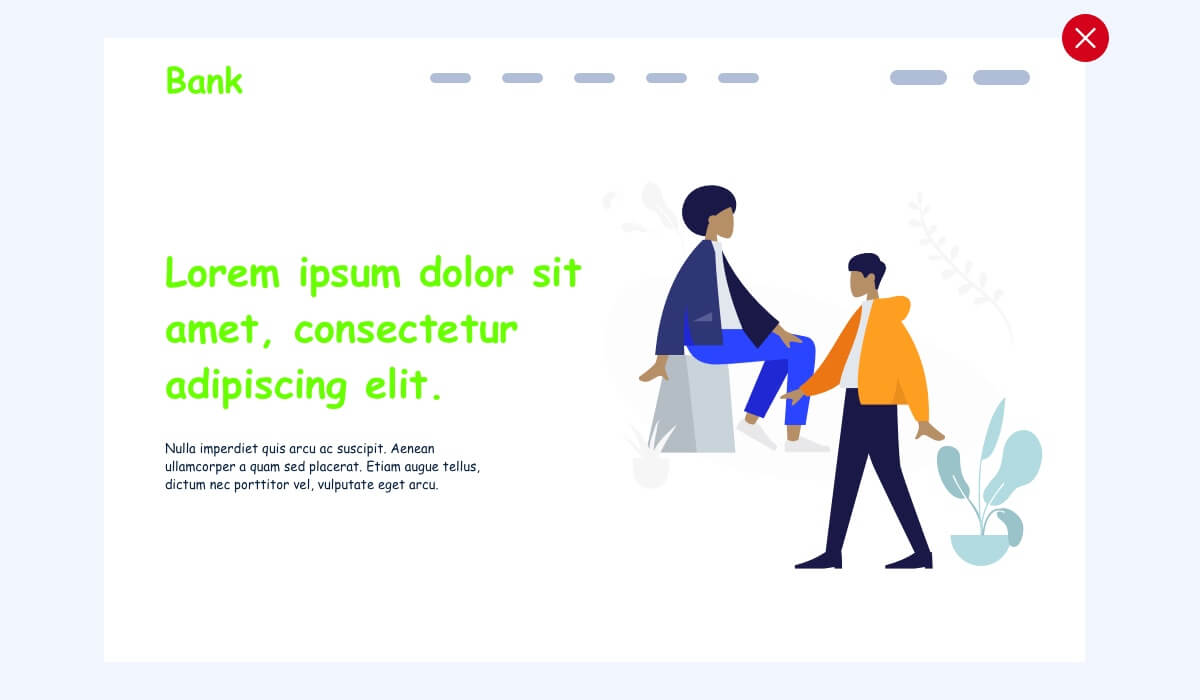
Lack of research
The single most crucial part of web design might just be doing your research and having a clear understanding of the content. You need to really dive into the subject and ask yourself a few important questions:
- what is the goal of the project
- what’s its target group
- what’s the project’s general vibe
- what emotions should it trigger
Depending on the industry or branch, the character and tone of the project will differ. You wouldn’t apply a sweet, candy-like style to an established bank’s campaign or a dry, informative one to e-commerce for baby carriages.
A lack of proper analysis can easily turn against us – we can avoid making fundamental mistakes just by doing our research ahead of time.
Hopefully, we managed to help resolve some of the issues that many young web designers can come across. We also strongly encourage you to share your projects – productive conversations, constructive criticisms and idea swapping are invaluable when it comes to developing your skillset and clearing up any doubts.
