Making digital accessible – Interview with Amanda Mace from AbleDocs
How do we make digital tools more accessible to users with disabilities? Maciej Nowak, Partner at Osom Studio seeks answers to this question and many more in a conversation with Amanda Mace, Vice-President of Australasia at AbleDocs. It’s a great opportunity to learn different perspectives on usability and hear some spicy details of the surprising way poor accessibility was affecting people with perfectly good vision.
Accessibility is no longer just a compliance issue – it’s a defining element of modern digital strategy. This article explores how companies can make their websites, apps, and content genuinely accessible, not only for users with disabilities but for everyone navigating digital products in diverse contexts. Whether you’re a designer, developer, or business leader, Amanda’s insights reveal how accessibility improves usability, performance, and brand trust all at once.
Amanda Mace, Vice-President of Australasia at AbleDocs, is one of the leading voices in accessibility globally. As a long-time W3C contributor and accessibility advocate, she’s worked with organizations worldwide to turn accessibility from a checklist into a mindset. In this conversation with Maciej Nowak from Osom Studio, she shares practical advice on building accessible processes that scale – showing that accessibility isn’t an add-on, it’s how great digital products are built.
Accessibility Is Everyone’s Business
Digital accessibility has long been treated as a niche concern – something for compliance checklists or specific user groups. Amanda Mace argues it’s time to flip that perspective. Accessibility, she says, is simply good design. It’s about ensuring digital products work for everyone, regardless of ability, device, or context.
Amanda has spent over a decade helping organizations make the digital world more inclusive. She’s seen firsthand how accessibility not only benefits users but also reduces long-term business risk and boosts product performance.
Accessibility shouldn’t be treated as an extra step or a nice-to-have. It should be part of how we define quality in digital experiences.
This perspective resonates with many teams she’s worked with: once accessibility is understood as part of quality, not cost, everything changes. Teams start seeing accessibility as part of the product’s integrity and long-term success, not just a technical task to check off. As Amanda puts it, inclusion becomes a core KPI, because what’s measurable can truly improve.
Teams that plan for accessibility from the start deliver faster, more resilient, and more inclusive products. Those that overlook it often face rework, legal exposure, or reputational harm down the line.
Beyond Compliance: Embedding Accessibility in Culture
When Amanda talks about accessibility, she doesn’t start with regulations or checklists. She starts with culture. For her, accessibility is a mindset shift, not a line item.
You can’t bolt accessibility on later. It has to be baked into the way your team thinks about users, design, and testing.
This statement summarizes the difference between organizations that treat accessibility as a one-off project and those that integrate it into their DNA. Amanda has seen that teams who make accessibility a shared habit, rather than a requirement, create better collaboration and fewer costly fixes later on. It’s the cultural investment that delivers compounding returns over time.
Amanda’s team works with organizations to embed accessibility into daily workflows – from design systems and documentation to code review and QA processes. This requires cross-functional collaboration: designers, developers, content creators, and project managers all play a role.
She emphasizes that accessibility maturity happens in stages. Companies often begin reactively – fixing issues after audits, then evolve toward proactive and finally systemic approaches, where accessibility is just how things are done.
The goal is to get to the point where accessibility isn’t a separate task. It’s just part of everyone’s job description.
Embedding accessibility takes structure and leadership buy-in, but it also thrives on storytelling. Amanda shares examples of how real users interact with inaccessible interfaces, and how small design oversights can create massive barriers.
I worked with a client who thought their color contrast was fine—until they saw their analytics showing users with perfect vision struggling to read content. Accessibility affects everyone in ways we often don’t see.
Her takeaway is clear: accessibility isn’t only about compliance or avoiding penalties. It’s about understanding people and removing barriers that limit engagement. That realization transforms teams – helping them design experiences that work better for everyone.
Accessibility Starts with Design
Amanda believes accessibility should begin at the design table, not at the code editor. Every design decision – from color palettes to navigation – can either enable or exclude.
Design systems are one of the most powerful tools for accessibility. If you build accessibility into the system, every project that uses it benefits automatically.
For teams, this means shifting perspective from “fix later” to “design right.” Amanda encourages designers to view accessibility guidelines not as constraints, but as creative parameters that enhance user experience for all audiences. Once those inclusive rules are baked into a system, the whole organization benefits from consistency and speed.
Designers, she says, should be empowered with practical tools: contrast checkers, keyboard navigation tests, and pattern libraries built on inclusive principles. Beyond tools, they need clear criteria for success. Accessibility standards like WCAG (Web Content Accessibility Guidelines) provide a framework, but real-world testing with diverse users ensures true inclusivity.
Automated tools will only catch about 30% of accessibility issues. You need people—testing, feedback, empathy—to uncover the rest.
Amanda’s experience underlines that accessibility is as much about empathy as it is about compliance. When designers test their work through different lenses – literally and figuratively – they gain insights automation can’t replicate. It’s this human factor that keeps accessibility authentic and relevant.
In practice, that means including users with disabilities in usability testing and prioritizing accessibility in design reviews. Amanda often points out that accessible design isn’t only about disability, it’s about context: users on mobile devices, in bright sunlight, or with limited connectivity all benefit from the same improvements.
Good design works for everyone, everywhere. Accessibility just makes that explicit.
This idea brings the discussion full circle – accessibility isn’t a constraint on creativity, but a measure of its success. When designers think inclusively, they’re not limiting their vision; they’re expanding it to reach more people, in more ways, across more contexts. For Amanda, that’s the future of digital design, where accessibility is the proof of excellence, not the afterthought.
Building Accessibility into Development Workflows
From a technical perspective, embedding accessibility means treating it as part of the Definition of Done. Amanda advises development teams to integrate accessibility testing at every sprint, rather than saving it for pre-launch QA.
If developers have accessible code snippets, linting tools, and checklists built into their environment, they’re not just coding faster—they’re coding better.
This insight captures her focus on enabling developers, not overwhelming them. When accessibility tools are part of the everyday workflow, they remove friction instead of adding it. Developers start writing cleaner code naturally, and accessibility debt never has a chance to pile up.
She also stresses the importance of continuous learning. Technologies evolve, frameworks change, and accessibility standards keep updating. Successful teams treat accessibility as an evolving skill, not a static checklist.
Accessibility isn’t something you learn once. It’s something you practice, measure, and improve continuously.
Amanda often notes that the most effective engineering teams use retrospectives to reflect on accessibility improvements. They review what worked, what didn’t, and what could scale better next time, turning accessibility into a process of iteration and learning rather than perfectionism.
For enterprise environments, automation helps scale accessibility across complex platforms, but human validation remains essential. Amanda often references how automated scans can miss things like keyboard focus states, ARIA misuse, or misleading alt text.
You can’t automate empathy. You still need people looking at how users actually experience your product.
Her point is simple: automation is a great ally but a poor replacement for human judgment. Real accessibility lives at the intersection of smart tools and human insight, ensuring products serve the people behind every screen.
Accessibility as Strategic Value
Accessibility is often positioned as a compliance cost, but Amanda argues it’s a business advantage. Inclusive products reach broader audiences, perform better in search rankings, and reflect well on brands.
Accessibility is about equity, but it’s also about performance. The more accessible your product, the more users can engage with it—and the more return you get on your investment.
She highlights how companies leading in accessibility also lead in digital transformation. By thinking inclusively, they build flexible systems that adapt to future technologies – from voice interfaces to AI-driven personalization.
When you build for accessibility, you’re building for longevity. You’re future-proofing your digital presence.
Amanda connects this to real enterprise outcomes: reduced technical debt, improved team morale, and stronger relationships with end users. Accessibility makes technology more human, and that humanity translates to business impact.
At the enterprise level, this becomes part of governance and reputation management. Accessibility compliance protects against legal risk, but accessibility excellence builds trust with users, partners, and regulators alike.
Digital accessibility is brand integrity. It shows you care about every user’s experience.
Her conclusion on this point is clear: accessibility isn’t just a metric, it’s a message. Every accessible interaction reinforces brand credibility – a small, everyday action that builds long-term loyalty.
The Human Side of Accessibility
Despite the technical frameworks, Amanda’s approach to accessibility always returns to people. Behind every guideline or metric is a person trying to accomplish something online.
When we talk about accessibility, we’re really talking about empathy. It’s about understanding the barriers people face and designing to remove them.
That’s why she believes accessibility should always stay human-centered. Amanda’s own projects have shown how empathy-driven changes, even small ones, can transform user experience for everyone involved.
She recalls stories from her work where small changes made a huge difference – a button label that finally made sense to screen readers, or a form flow that allowed users to complete a task independently for the first time. Those wins, she says, are what keep teams motivated.
The most powerful feedback we get is from users who say, ‘I could finally do this myself.’ That’s when accessibility becomes personal.
For Amanda, these stories prove that accessibility is more than compliance – it’s liberation. When users feel seen and empowered, products gain a new level of purpose and credibility that no marketing campaign can replicate.
Accessibility success stories aren’t limited to users with disabilities. Simplified navigation helps busy parents with one hand on a phone. Transcripts assist users in noisy environments. Clear color contrast improves usability for everyone.
Accessibility benefits everyone—it’s universal design in action.
She sums it up perfectly: accessibility doesn’t divide audiences – it unites them. When digital spaces are built for inclusion, everyone benefits, and brands earn trust naturally.
Where to Start: Practical Advice for Teams
Amanda’s advice to organizations beginning their accessibility journey is simple: start small, but start now.
You don’t need to fix everything at once. Pick one area—your design system, your content, your forms—and start improving accessibility there.
She urges teams to find small, achievable wins early, proving accessibility’s impact to stakeholders. Quick successes help build internal momentum and open the door for deeper organizational change. She recommends identifying an accessibility champion within the team – someone responsible for keeping accessibility visible and prioritized. Leadership support is vital, but so is grassroots energy from designers and developers who care.
Culture change happens when accessibility becomes part of everyday conversation. That’s when you know it’s real.
Amanda says the real magic happens when accessibility discussions become routine – when they’re part of standups, sprint reviews, and design critiques. That’s how accessibility grows from a goal into a habit. Training, documentation, and regular audits keep momentum going. Amanda encourages teams to share success stories internally to maintain engagement.
Accessibility isn’t about perfection—it’s about continuous improvement.
That mindset of progress over perfection, she notes, is what makes accessibility sustainable long term. It’s about moving forward together, one inclusive decision at a time.
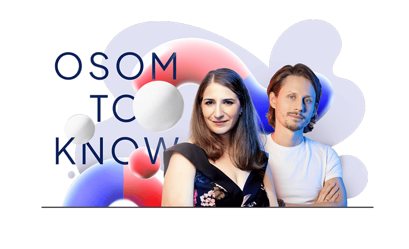
Full conversation with Amanda Mace
Want to hear the full conversation with Amanda Mace? Check out the latest 🎙️ Osom to Know podcast.
You can also watch us on YouTube – don’t forget to hit subscribe! 📩
At Osom Studio, we help brands design and develop inclusive, accessible WordPress solutions that meet both user needs and business goals. If you need a support with your service, we’re here to help.