Revitalising the website and brand for IT consulting company.
GGS facilitates digital transformation in enterprise-sized companies. Smart technologies offered by the company help to save time, cut costs, and increase the bottom line of their partners. Their solutions are custom-built to match each business’ individual needs.
Client
GGS
Year
2021
Services we provided
- Visual identity
- UX / UI
- Development
- CMS integration
Website
Timeline
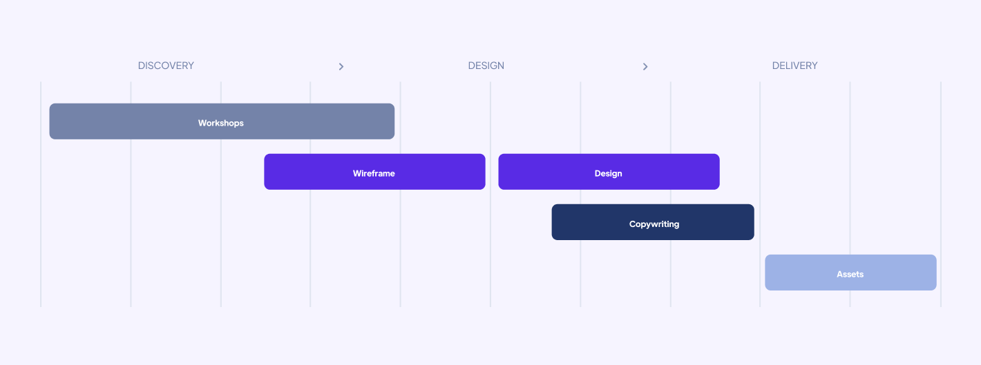
Similarly to GGS’ style of work, we too focus on the individual approach. That’s why defining a clear and clean design process is always our top priority and the first phase of any project. The result is a detailed plan that puts Osom and the client on the same team, allowing us to move forward quickly, systematically, and without looking back. Thanks to this approach, we avoid going back to previous stages of implementation and answering the questions that have already been answered.
Workshops
The project phase was kicked off with a workshop session, which is a key element of our every project. Such a meeting allows the Osom team to define the client’s business goals and all other aspects of the implementation from the very beginning. Often, it is also the moment when the client rediscovers their brand; a chance to look at the business from a completely different perspective and discover new opportunities for growth.
During the workshop, we redefined the tone of voice and GGS’ values. Based on the exercises and the survey, we defined 2 archetypes that described the brand most accurately.
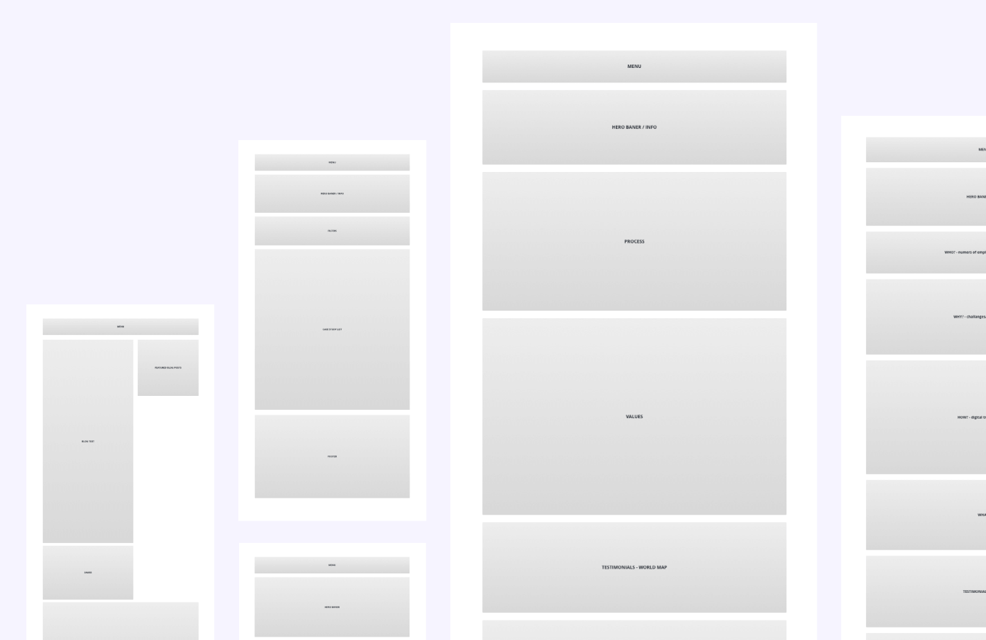
Wireframes
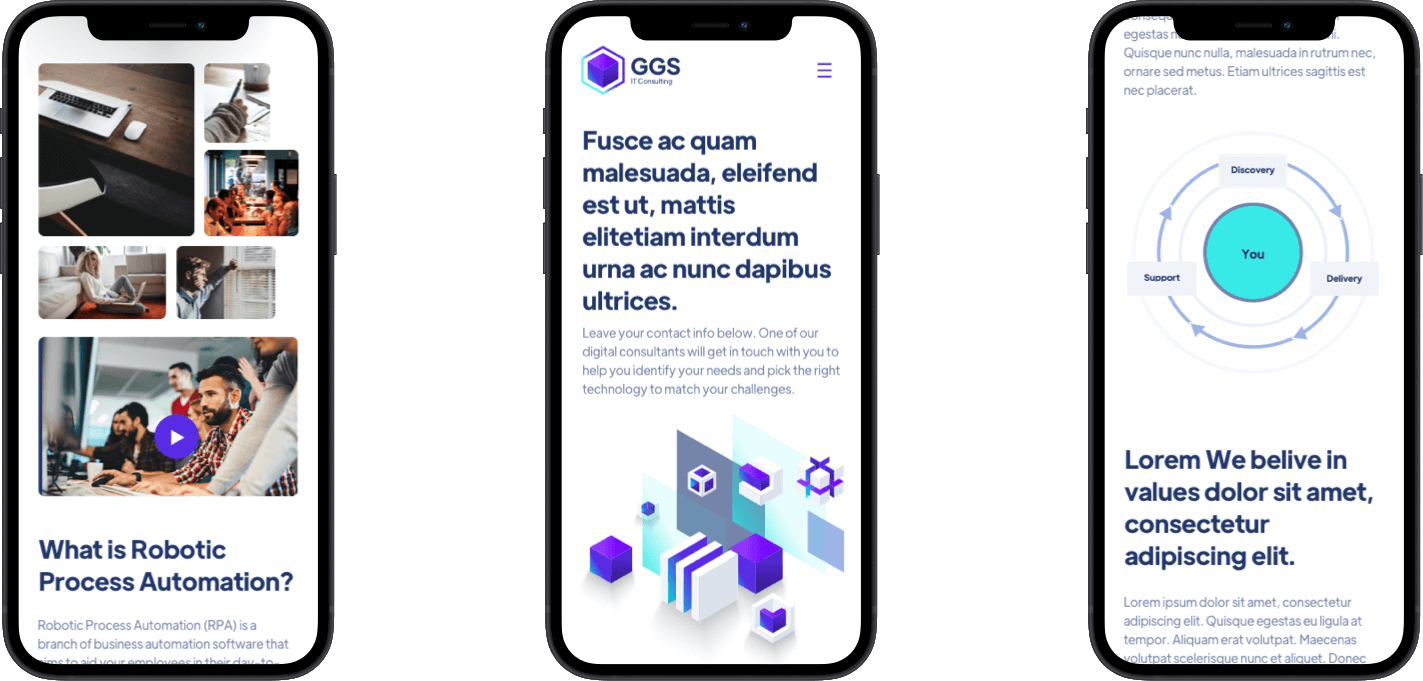
The workshops constituted the basis for the wireframing phase, which outlined the layout of the information architecture. We focused on the “foundations” – the elements always present on the website, which we structured so that they’d correspond with the conclusions derived from our sessions. A detailed layout and composition came next; we presented them once the initial wireframes had been accepted by GGS. The result was a detailed, thoroughly-planned user conversion path: we focused on building the entire story behind the visit, as well as the sequence in which the user would browse the site.
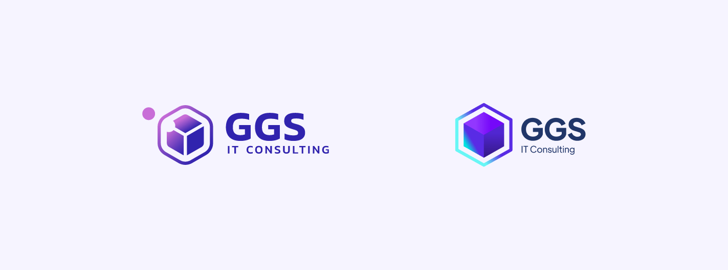
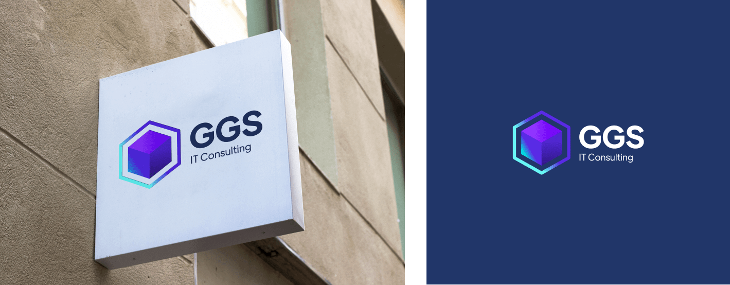
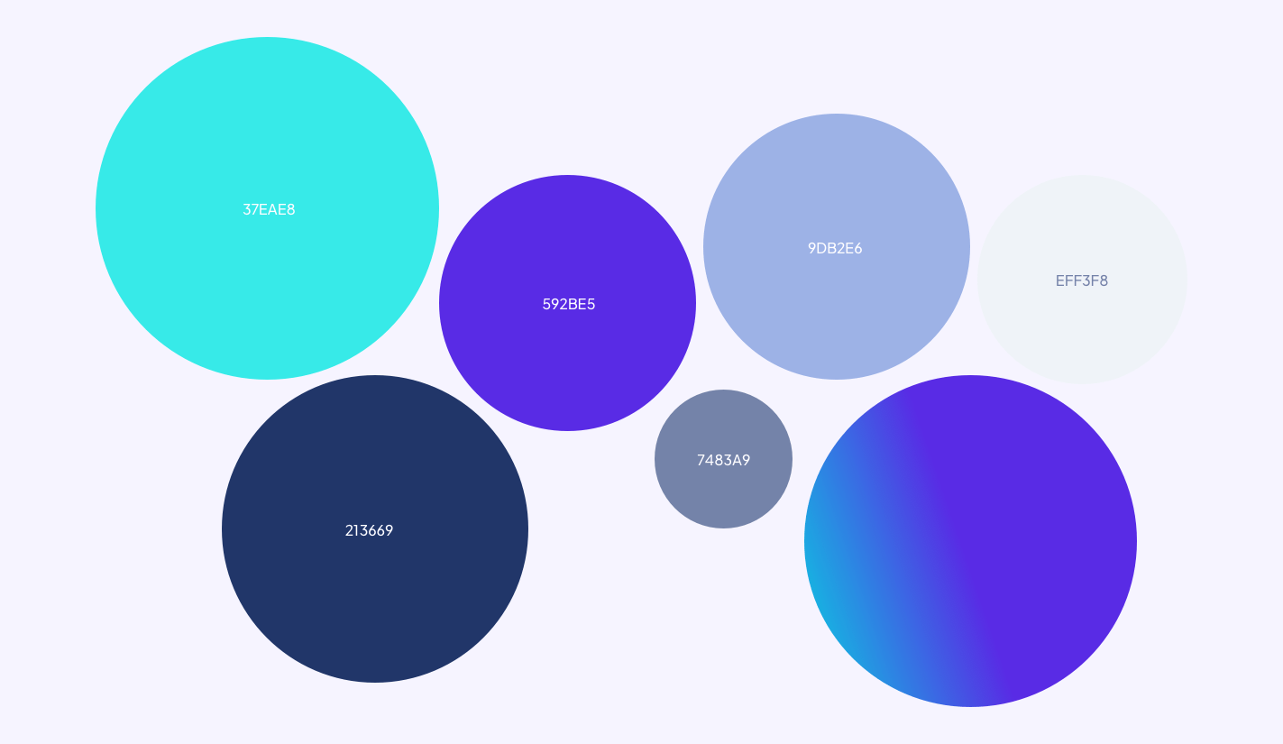
Logo
Up to this point, GGS had used a simple, cube-shaped logo. Instead of opting for something completely new, we decided to use this element and give it a modern spin. The new shape was also utilized in other areas of the realisation.
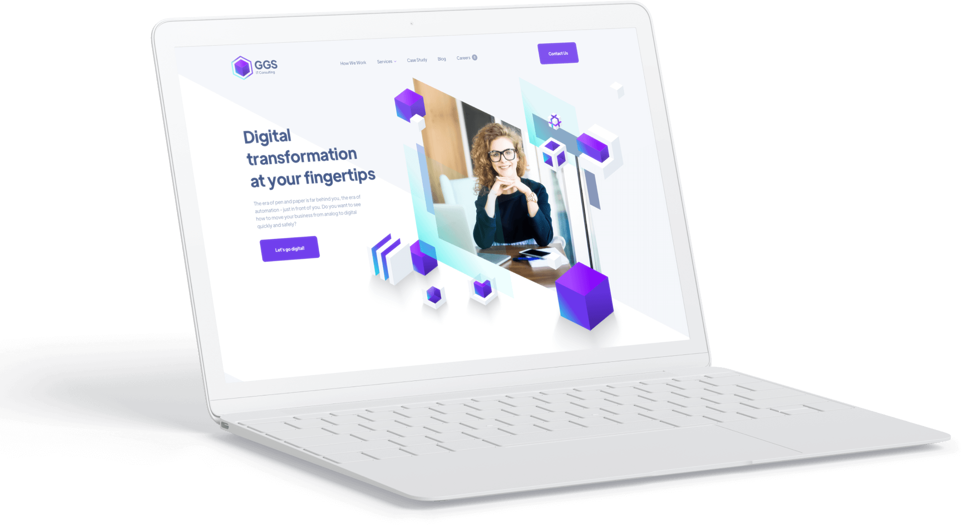
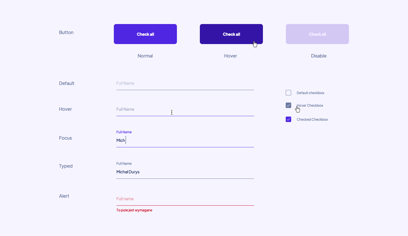
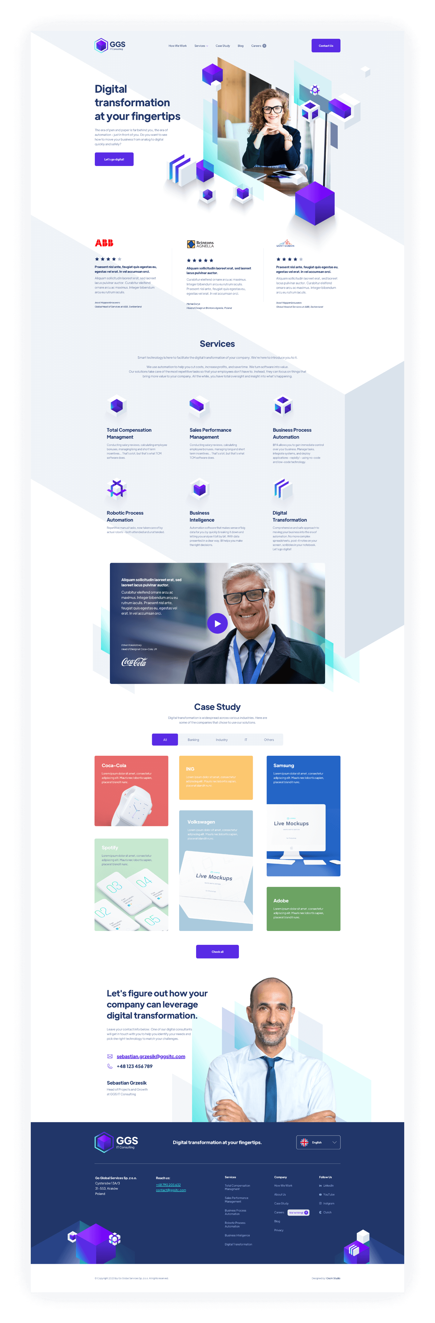
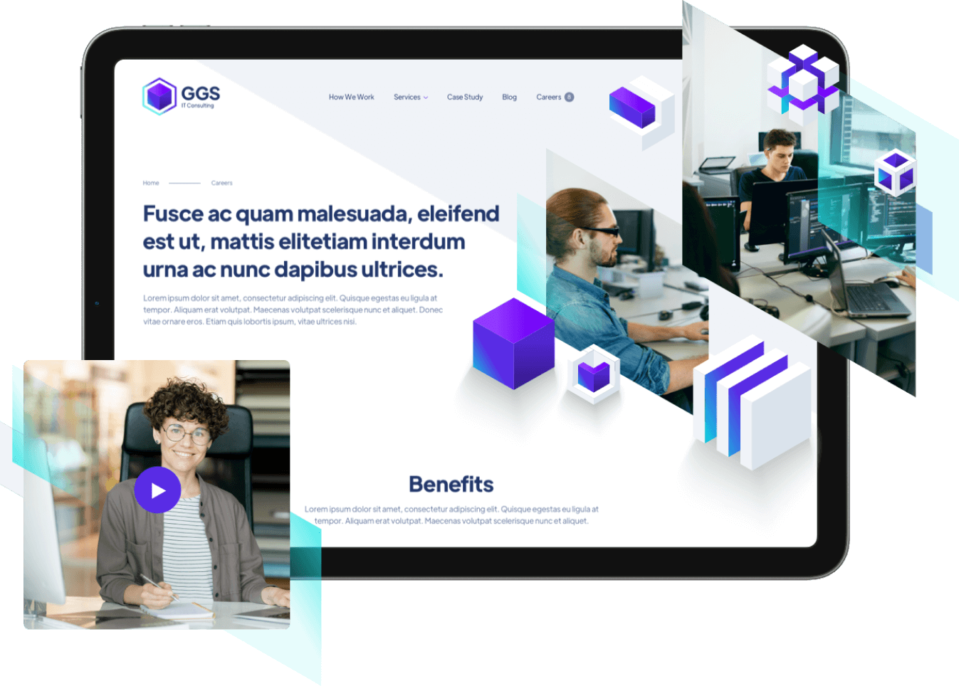
Website
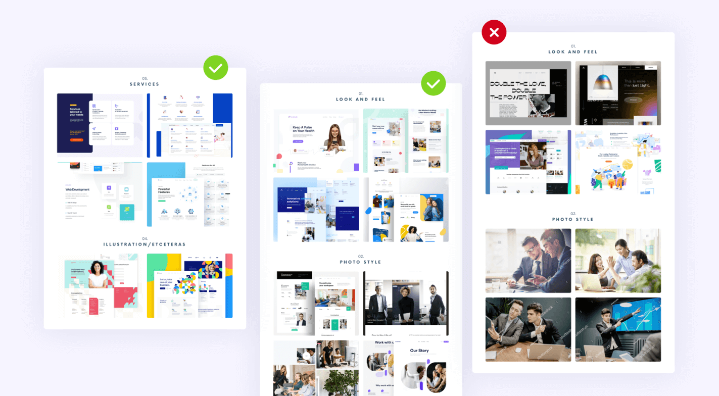
The last stage of the project was designing the subpages, which would stylistically match the handbook’s contents. First and foremost, the website had to have a clean interface. At the same time, we wanted it to stand out from the crowd. Did we manage to do it? See for yourselves!
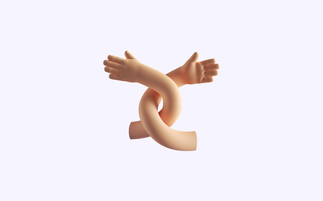
The Companion
This archetype best embodies the feeling of belonging to a group. The Companion doesn’t like to stand out – they prefer to be a discreet helper who doesn’t take credit for the work they’ve helped with. They want to accompany us every day.
GGS is the Companion because:
- They create valuable solutions and help customers each day.
- They help discreetly, not taking center stage. They build a relationship with the client and accompany them in the process of digital transformation.
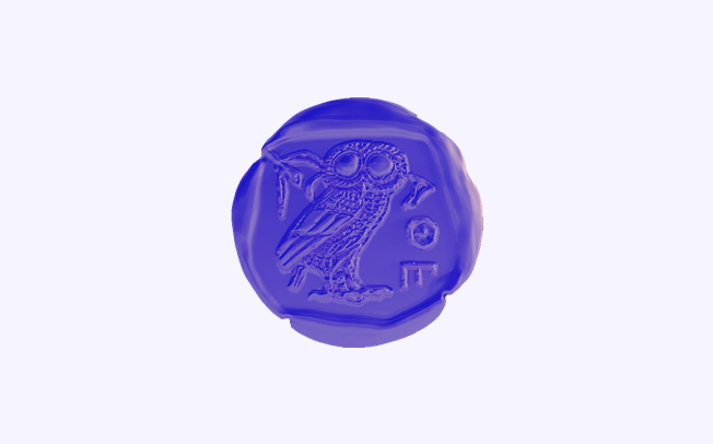
The Sage
Knowledge is the most important thing in their life and the most important value. However, the Sage does not acquire it for their own benefit, but rather: to educate others. It is an archetype for expert brands considered to be authorities in their field.
GGS is the Sage because:
- GGS’ solutions are based on expert knowledge that the company wants to share.
- GGS are a team of experts in their field.
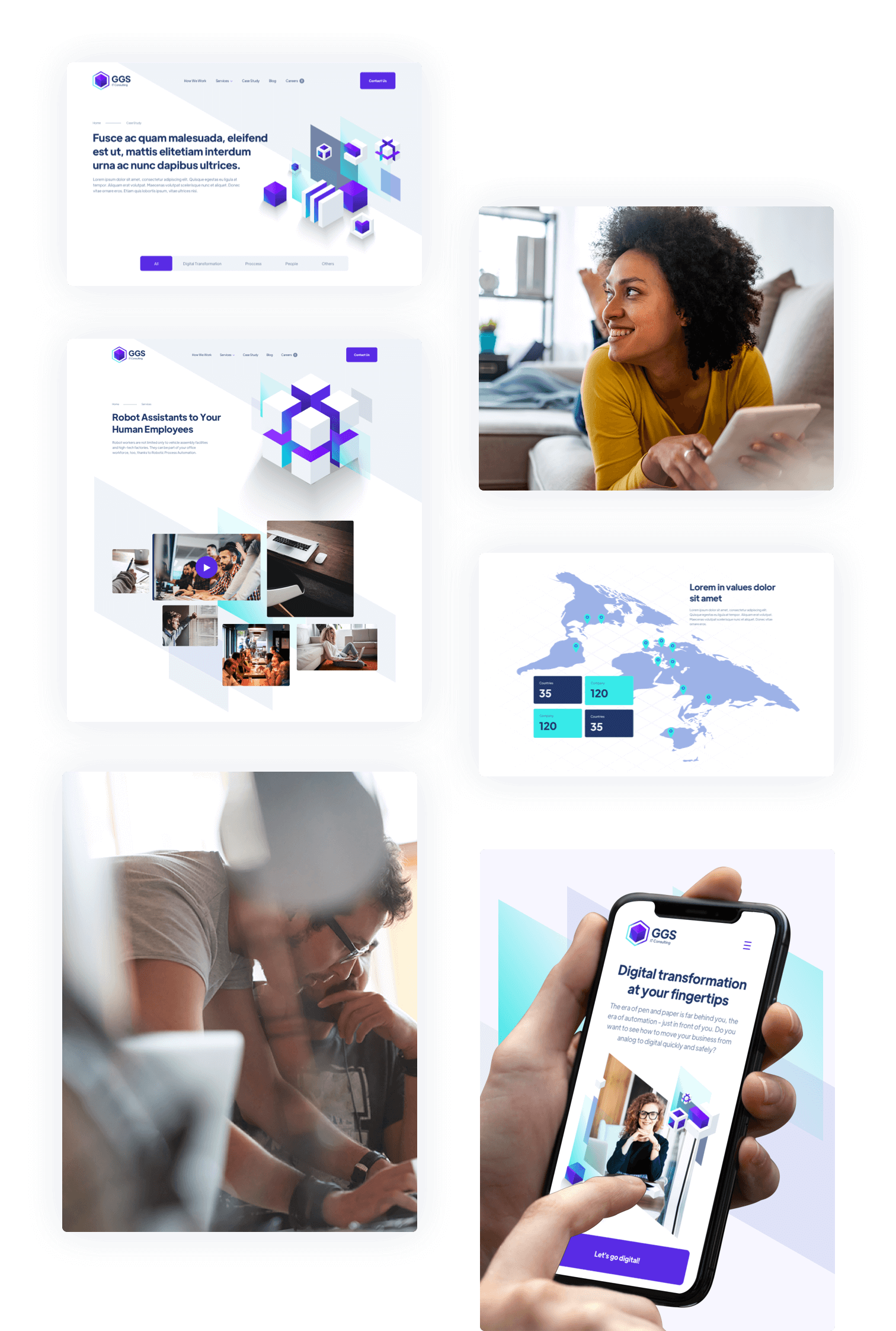
GGS contacted us because they were not happy with their website at all. Its unnecessarily complex structure and outdated design eventually gave way to an Osom Studio-designed, modern, user-friendly website that stands out from the rest of the industry.
The proposed design is based on IT-characteristic colors and geometric shapes. Its character is modern and fresh, perfectly reflecting the brand’s personality, and going hand-in-hand with GGS’ solutions. The workshops allowed us to create a website that will become an effective tool for building the company’s sales funnel, as well as its brand recognition.
Thanks to this cooperation, GGS not only built a new website, but also had the opportunity to reevaluate the company’s strategic assumptions and look at its operations from a different perspective. Projects like this – when we not only create the solutions in question, but also open up new opportunities for the client – are the most OSOM ones for our team.
Is there a project on your horizon? Brief us in!
Let us know when you’re free, and we’ll schedule a short intro meeting online. You tell us about your project, we will ask questions, you will ask questions and max. 30 minutes later, we will know if we’re the right fit.